26.09,23-/Week1-Week
LI JINGBU /0367209
Typography/Bachelor of design (Hons) creative media/Taylor's University
Task 1/ Exercises
LECTURES
Week 01
Lecture 01: Introductions
In lecture, Mr. Vinod introduced us to typography. He explained that Typography is an act of creating typefaces or type families. I learned that typography has envolved over 500 years from calligraphy to digitalization. It is "the art and technique of arranging type to make written language legible, readable, and appealing when displayed". And the process also created numbers and symbols. Typography is now something everyone dose.
Typography can be seen at everywhere in our daily lives, Typography is applied in animation, website design, application design, posters, books and more.
Font: refers to the individual font or weight within a typeface, I.e.: Georgia Regular, Georgia Italic and Georgia Bold or Frutiger Light, Roman.
Typeface: refers to the various families that do not share characteristics, I.e.: Georgia, Arial, Times New Roman, Didot and Futura
Lecture 02: Development/ Timeline
In lecture 2, we learnt about the development and timeline about typefaces.
1.Early letterform development: Phoenician to Roman: Initially writing meant scratching into wet clay with sharpened stick or carving into stone with a chisel. The forms of uppercase letterforms (for nearly 2000 years the only letterforms) can be seen to have evolved out of these tools and materials. At their core, uppercase forms are simple combination of straight lines and pieces of circles, as the materials and tools of early writing required.
The Greeks changed the direction of writing. Phoenicians, like other Semitic peoples, wrote from right to left. The Greek developed a style of writing called ‘boustrophedon’ (how the ox ploughs), which meant that the lines of text read alternately from right to left and left to right. As they change the direction of reading they also changed the orientation of the letterforms:
Etruscan (and then Roman) carvers working in marble painted letterforms before inscribing them. Certain qualities of their strokes—a change in weight from vertical to horizontal, a broadening of the stroke at start and finish—carried over into the carved letterforms.
Late 1st century B.C.E., Augustan inscription in the Roman Forum, Rome.
2.Hand script from 3rd – 10th century C.E.: square capitals were the written version that can be found in Roman monuments. These letterforms have serifs added to the finish of the main strokes.
4th or 5th century: Square Capitals
A compressed version of square capitals, rustic capitals allowed for twice as many words on a sheet of parchment and took far less time to write. The pen or brush was held at an angle of approximately 30° off the perpendicular. Although rustic capitals were faster and easier to, they were slightly harder to read due to their compressed nature.
Late 3rd – mid 4th century: Rustic capitalsBoth square and rustic capitals were typically reserved for documents of some intended performance. Everyday transactions, however were typically written in cursive hand in which forms were simplified for speed. We can see here the beginning of what we refer to as lowercase letterforms.
4th century: Roman cursiveUncials incorporated some aspects of the Roman cursive hand, especially in the shape of the A, D, E, H, M, U and Q. ‘Uncia’ is Latin for a twelfth of anything; as a result, some scholars think that uncials refer to letters that are one inch (one twelfth of foot) high. It might, however, be more accurate to think of uncials simply as small letters. The broad forms of uncials are more readable at small sizes than rustic capitals.
4th – 5th century: UncialsA further formalization of the cursive hand, half-uncials mark the formal beginning of lowercase letterforms, replete with ascenders and descenders, 2000 years after the origin of the Phoenician alphabet.
Charlemagne, the first unifier of Europe since the Romans, issued an edict in 789 to standardize all ecclesiastical texts. He entrusted this task to Alcuin of York, Abbot of St Martin of Tours. The monks rewrote the texts using both majuscules (uppercase), miniscule, capitalization and punctuation which set the standard for calligraphy for a century.
C. 925: Caloline miniscule
3.Blackletter to Gutenberg’s type: With the dissolution of Charlemagne’s empire came regional variations upon Alcuin’s script. In northern Europe, a condense strongly vertical letterform know as Blackletter or textura gained popularity. In the south, a rounder more open hand gained popularity, called ‘rotunda’. The humanistic script in Italy is based on Alcuin’s miniscule.
c. 1300: Blackletter (Textura)
Gutenberg’s skills included engineering, metalsmithing, and chemistry. He marshaled them all to build pages that accurately mimicked the work of the scribe’s hand – Blackletter of northern Europe. His type mold required a different brass matrix, or negative impression, for each letterform.
c. 1455: 42 line bible, Johann Gutenberg, Mainz
3.Text type classification (Dates of origin approximated to the nearest quarter century.
Week 02
Lecture 03: Typo_3_Text_Part1
1.Text/ Tracking and Letterspacing
Kerning: automatic adjustment of space between letters. letterspacing means to add space between the letters.
Tracking: the addition and removal of space in a word or sentence.<
2.Text/ Formatting
Flush left: This format most closely mirrors the asymmetrical experience of handwriting. Each line starts at the same point but ends wherever the last word on the line ends. Spaces between words are consistent throughout the text, allowing the type to create an even gray value.
Centered: This format imposes symmetry upon the text, assigning equal value and weight to both ends of any line. It transforms fields of text into shapes, thereby adding a pictorial quality to material that is non-pictorial by nature. Because centered type creates such a strong shape on the page, its important to amend line breaks so that the text does not appear too jagged.

Flush right: This format places emphasis on the end of a line as opposed to its start. It can be useful in situations (like captions) where the relationship between text and image might be ambiguous without a strong orientation to the right.
Justified: Like centering, this format imposes a symmetrical shape on the text. It is achieved by expanding or reducing spaces between words and, sometimes, between letters. The resulting openness of lines can occasionally produce ‘rivers’ of white space running vertically through the text. Careful attention to line breaks and hyphenation is required to amend this problem whenever possible.
3.Text/ Texture
Type with a rela
tively generous x-height or relatively heavy stroke width produces a darker mass on the page than type with a relatively smaller x-height or lighter stroke. Sensitivity to these differences in colour is fundamental for creating successful layouts.
4. Text/ Leading and Line Length
The goal in setting text type is to allow for easy, prolonged reading. At the same time a field of type should occupy the page as much as photograph does.
Type size: Text type should be large enough to be read easily at arms length—imagine yourself holding a book in your lap.
Leading: Text that is set too tightly encourages vertical eye movement; a reader can easily loose his or her place. Type that is set too loosely creates striped patterns that distract the reader from the material at hand.
Line Length: Appropriate leading for text is as much a function of the line length as it is a question of type size and leading. Shorter lines require less leading; longer lines more. A good rule of thumb is to keep line length between 55-65 characters. Extremely long or short lines lengths impairs reading.
Text / Type Specimen Book
A type specimen book (or ebook for screen) is to provide an accurate reference for type, type size, type leading, type line length etc.
Sample Type Specimen Sheet
Compositional requirement: Text should create a field that can occupy a page or a screen. Think of your ideal text as having a middle gray value (on the left, in the diagram on the next slide),
not a series of stripes (as seen of the one on the right)
Week 03
Lecture 04: Typo_4_Text_ Part2
1.Indicating Paragraphs
Mr Vinod introduced some ways to indicate paragraphs clearly
There are several options for indicating paragraphs. In the first example, we see the ‘pilcrow’ (¶), a holdover from medieval manuscripts seldom use today.
Indentation: The example here displays the standard indentation. Typically here the indent is the same size of the line spacing or the same as the point size of your text.
2.Widows and Orphans
A widow is a short line of type left alone at the end of a column of text.
An orphan is a short line of type left alone at the start of new column.
3.Highlighting Text
some ways to highlight includes:
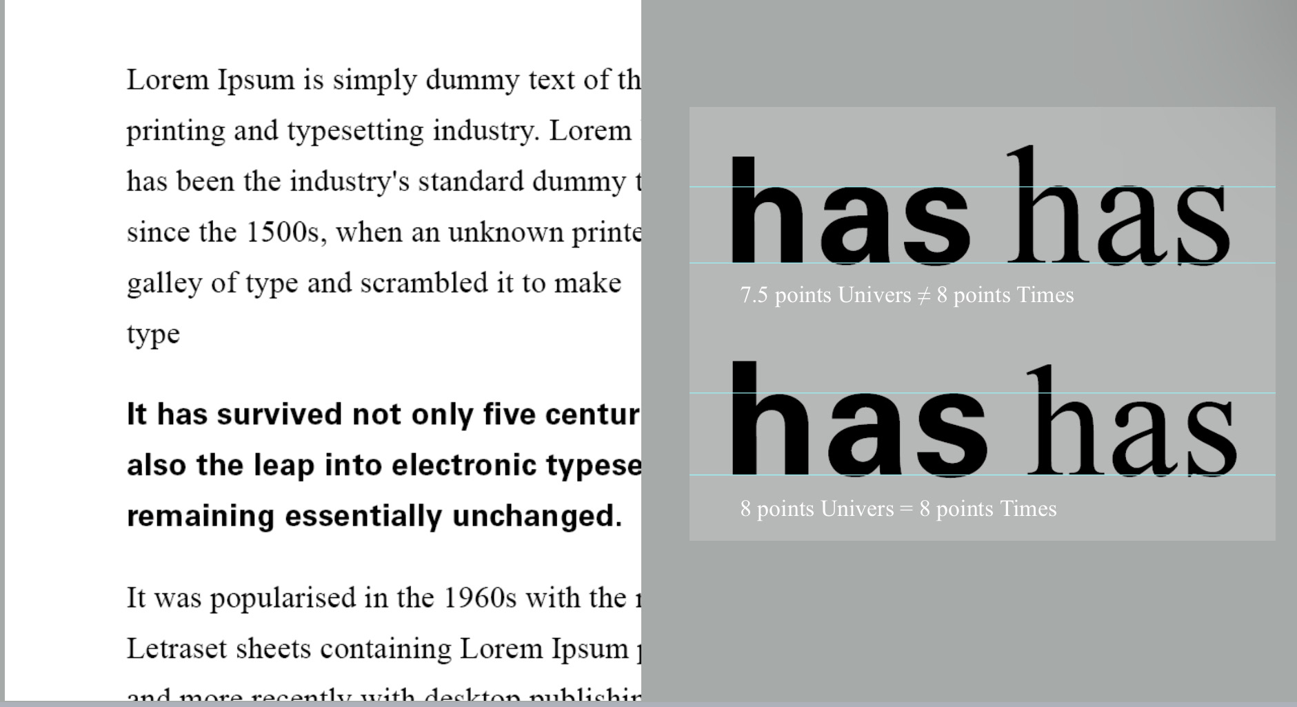
the sans serif font (Univers) has been reduced by .5 to match the x-height of the serif typeface. 8 ≠ 7.5
Quotation marks, like bullets, can create a clear indent, breaking the left reading axis. Compare the indented quote at the top with the extended quote at the bottom.
4.Headline within Text
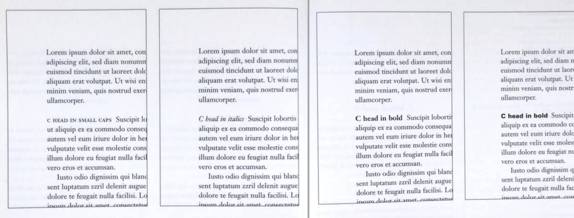
There are many kinds of subdivision within text of a chapters. In the following visuals these have been labeled (A, B and C) according to the level of importance.
A head indicates a clear break between the topics within a section. In the following examples ‘A’ heads are set larger than the text, in small caps and in bold. The fourth example shows an A head ‘extended’ to the left of the text.
The B head here is subordinate to A heads. B heads indicate a new supporting argument or example for the topic at hand.
The C heads, although not common, highlights specific facets of material within B head text. They not materially interrupt the flow of reading. As with B heads, these C heads are shown in small caps, italics, serif bold and san serif bold. C heads in this configuration are followed by at least an em space for visual separation.
5. Cross Alignment
Cross aligning headlines and captions with text type reinforces the architectural sense of the page—the structure—while articulating the complimentary vertical rhythms.
Week 04
Lecture 05: Typo_2_Basic
1. Describing letterforms
It is important for us to know a letterform's component parts to identify specific typefaces. Below are some components we need to know.
Baseline The imaginary line the visual base of the letterforms.
Median The imaginary line defining the x-height of letterforms.
X-height The height in any typeface of the lowercase ‘x’.
Stroke Any line that defines the basic letterform
Stroke Any line that defines the basic letterform
Apex / Vertex The point created by joining two diagonal stems (apex above and vertex below)
Arm Short strokes off the stem of the letterform, either horizontal (E, F, L) or inclined upward (K, Y).
Ascender The portion of the stem of a lowercase letterform that projects above the median.
Barb The half-serif finish on some curved stroke.Beak The half-serif finish on some horizontal arms.
Bowl The rounded form that describes a counter. The bowl may be either open or closed.
Bracket The transition between the serif and the stem.Cross Bar The horizontal stroke in a letterform that joins two stems together
Cross Stroke The horizontal stroke in a letterform that joins two stems together
Crotch The interior space where two strokes meet.
Descender The portion of the stem of a lowercase letterform that projects below the baseline.Ear The stroke extending out from the main stem or body of the letterform.
Em/en Originally refering to the width of an uppercase M, and em is now the distance equal to the size of the typeface (an em in 48 points, for example). An en is half the size of an em. Most often used to describe em/en spaces and em/en dashes.
Terminal The self-contained finish of a stroke without a serif. This is something of a catch-all term. Terminals may be flat (‘T’ above), flared, acute, (‘t’ above), grave, concave, convex, or rounded as a ball or a teardrop (see finial).
2.The font
We should make sure that we are working with a full font and know how to use it to work successfully with type.
Uppercase Capital letters, including certain accented vowels, the c cedilla and n tilde, and the a/e and o/e ligatures.
Lowercase Lowercase letters include the same characters as uppercase.
Small Capitals Uppercase letterforms draw to the x-height of the typeface. Small Caps are primarily found in serif fonts as part of what is often called expert set.
Most type software includes a style command that generates a small cap based on uppercase forms. Do not confuse real small caps with those artificially generated.
Uppercase Numerals Also called lining figures, these numerals are the same height as uppercase letters and are all set to the same kerning width. They are most successfully used with tabular material or in any situation that calls for uppercase letters.
Lowercase Numerals Also known as old style figures or text figures, these numerals are set to x-height with ascenders and descenders. They are best used when ever you would use upper and lowercase letterforms. Lowercase numerals are far less common in sans serif type-faces than in serif.
Italic Most fonts today are produced with a matching italic. Small caps, however, are almost always only roman. The forms in a italic refer back to fifteenth century Italian cursive handwriting. Oblique are typically based on the roman form of the typeface.
Punctuation, miscellaneous characters Although all fonts contain standard punctuation marks, miscellaneous characters can change from typeface to typeface. It’s important to be acquainted with all the characters available in a typeface before you choose the appropriate type for a particular job.
Ornaments Used as flourishes in invitations or certificates. They usually are provided as a font in a larger typeface family. Only a few traditional or classical typefaces contain ornamental fonts as part of the entire typeface family (Adobe Caslon Pro).
3.Describing typefaces
Roman The letterform is so called because the uppercase forms are derived from inscriptions of Roman monuments. A slightly lighter stroke in roman is known as ‘Book’.
Italic Named for fifteenth century Italian handwriting on which the forms are based. Oblique conversely are based on roman form of typeface
Boldface Characterized by a thicker stroke than a roman form. Depending upon the relative stroke widths within the typeface, it can also be called ‘semibold’, ‘medium’, ‘black’, ‘extra bold’, or super. In some typefaces (notably Bodoni), the boldest rendition of the typeface is referred to as ‘Poster’.
4.Comparing typefaces
Week 05
Lecture 06: Typo_5_Understanding
1.Understanding letterforms
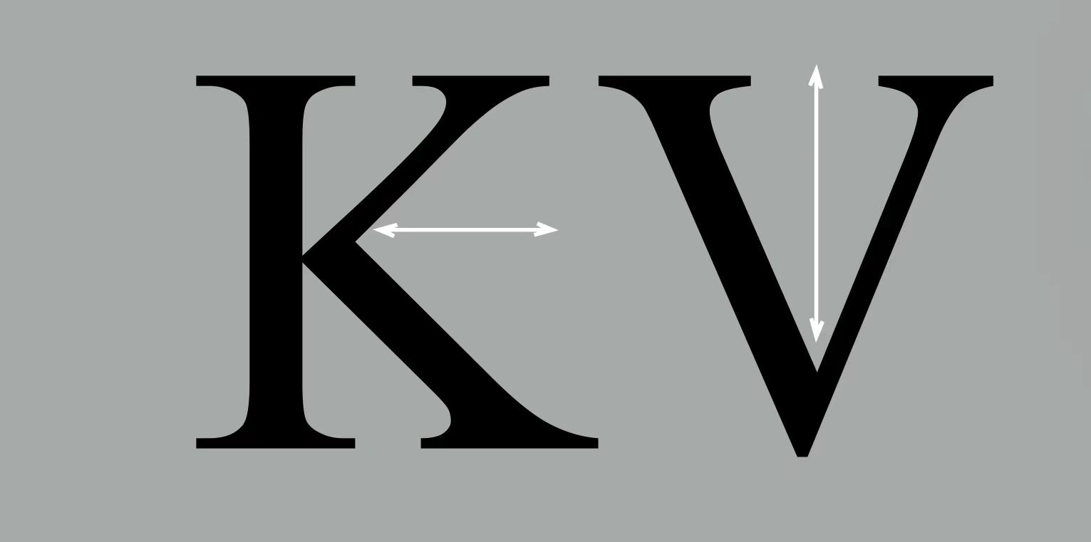
The uppercase letter forms below suggest symmetry, but in fact it is not symmetrical. It is easy to see the two different stroke weights of the Baskerville stroke form (below); more noteworthy is the fact that each bracket connecting the serif to the stem has a unique arc.
2.Letters
The uppercase letter forms may appear symmetrical, but a close examination shows that the width of the left slope is thinner than the right stroke. Both Baskerville (previous) and Univers (below) demonstrate the meticulous care a type designer takes to create letterforms that are both internally harmonious and individually expressive.
The complexity of each individual letterform is neatly demonstrated by examining the lowercase ‘a’ of two seemingly similar sans-serif typefaces—Helvetica and Univers. A comparison of how the stems of the letterforms finish and how the bowls meet the stems quickly reveals the palpable difference in character between the two.
3.Maintaining x-height
the x-height generally describe the size of the lowercase letterforms. However, you should keep in mind that curved strokes, such as in ‘s’, must rise above the median (or sink below the baseline) in order to appear to be the same size as the vertical and horizontal strokes they adjoin.
4.Counterform
The latter is particularly and important concept when working with letterforms like lowercase ‘r’ that have no counters per se. How well you handle the counters when you set type determines how well words hang together—in other words, how easily we can read what’s been set.
5.Contrast
The basic principles of Graphic Design apply directly to typography. The following are some examples of contrast—the most poweful dynamic in design—as applied to type, based on a format devised by Rudi Ruegg.
The simple contrasts produces numerous variations: small+organic/large+machined; small+dark/ large light …
INSTRUCTIONS
Taxt 1: Type Expression
Compose and express the chosen 4 words using any of the 10 typrefaces provided.
Research
My inspiration for the design of these words comes from these two pictures.
Each word of "just my type" uses a different font, showing its own unique style, which is also very corresponding to these three words.
The shadow in the figure echoes the original meaning of the word shadow with the help of font projection, which is very interesting.
Sketches
The four words I have chosen are Roar, Dive, Stab and Huge.
Digitalization
A) Roar
my design idea: The word roar goes from small to large, from virtual to real, showing the process of the sound gradually coming out
B)Dive
my design idea: Each letter in the word dive goes down gradually to show the process of diving.
C)Huge
my design idea: highlight the feeling of large by comparing H with the size of uge.
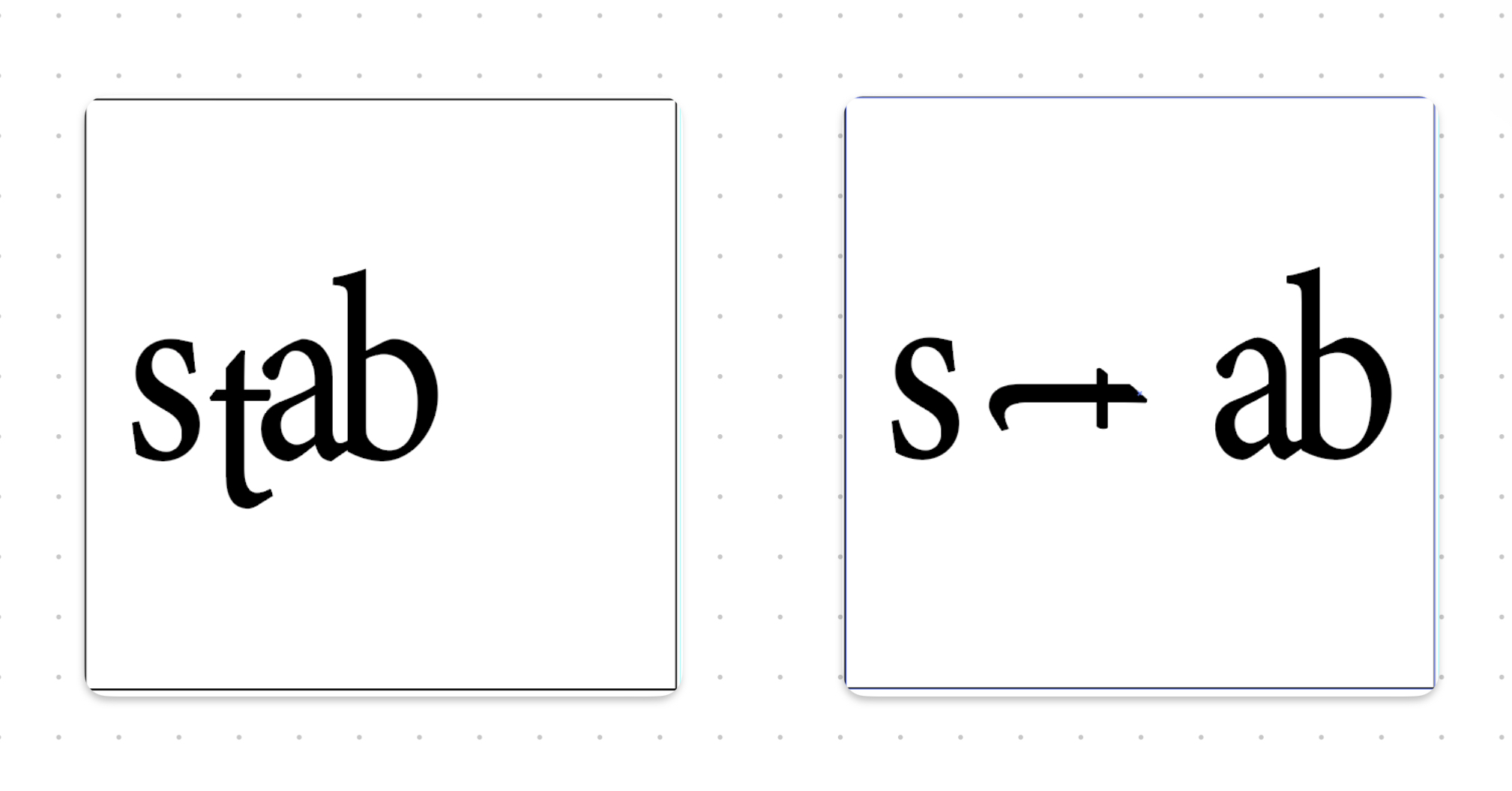
D)Stab
my design idea: s is like a person, and t is a knife, and s stabs a and b with the t.
Final Task : Type Expression
Animated Task Expression:
Taxt 1: Text Formatting
1.kerning and tracking exercise
The first task traced our names in ten different fonts.
(with kerning)
2.Layout
Final Layout
HEAD
Font/s: Bodoni Std& Serifa
Type Size/s: 42pt&22pt
Leading: 13pt
Paragraph spacing: 0
BODY
Font/s: Adobe Caslon Pro
Type Size/s: 10pt
Leading: 13pt
Paragraph spacing:11pt
Characters per-line: 55
Alignment: justify align Left-left justified last line
Margins: 13mm top, 13 mm left + 13 mm right + 30 mm bottom
Columns: 2
Gutter: 5 mm
pdf: with grid
FEEDBACK
WEEK2:
General Feedback: Mr Vinod suggested that we need to take a clear sketch.
Specific Feedback:Ms Hsin said that the overall idea of my sketch for roar was OK, but the sketch for stab was not so good.
WEEK3:
General Feedback: We need to update the blog more seriously.
Specific Feedback:Ms Hsin reminded me to digitalis my text expressions as soon as possible. Complete the task on time.
WEEK4:
General Feedback: GIF needed to add enough frames and made it look smooth when play.
Specific Feedback: Ms Hsin Yin recommended to update design process.
WEEK5:
General Feedback: Remember to update blog every week.
Specific Feedback:The text is not aligned with the grid and needs to be modified.
REFLECTION
EXPERIENCE:Through these weeks of study, I gradually learned softwares ai, id and ps, gained a deeper understanding of typography, and explored more strange field. Gave me a deeper understanding.
OBSERVASION: Everyone's observation and expression are different, and the works should present their own thinking and ideas.
FURTHER READING
The book I decided to read this week is A Type Primer by John Kane.
A Type Primer by John Kane
The use of Spaces is very important in typography. A serious typographer constantly monitors and manipulates the relationship of form (where type is) to counter-form (where it isn't). To understand this relationship, it is essential to see type as a progres sion of spaces (right). Changing any one space immediately alters its relationship with all the other spaces.
typography employs a number of technical terms. These mostly describe specific parts of letterforms.Knowing a letterform's component parts makes it much easier to identity specific typefaces
Uppercase
Capital letters, including certain accented vowels, the c cedilla (c) and n tilde (h), and the a/e and o/e ligatures (a, œe).
Lowercase
Lowercase letters include the same characters as uppercase plus f/i, f/1, f/f, f/f/i, and f/f/I ligatures, and the
'esset' (German double s).
Small capitals
Uppercase letterforms, drawn to the ×-height of the typeface. Small caps are primarily found in serif fonts.
Most type software includes a style command that generates a small cap based upon uppercase forms. Do not confuse real small caps with those generated artificially.
Uppercase numerals
Also called lining figures, these numerals are the same height as uppercase letters and are all set to the same kerning width. They are most successfully used with tabular material or in any situation that calls for uppercase letters.
Lowercase numerals
Also called oldstyle figures or text figures, these numerals are set to x-height with ascenders and descenders. They are best used wherever you would use upper- and lowercase letterforms. Lowercase numerals are far less common in sans serif than in serif typefaces.
Italic
Most fonts today are produced with a matching italic. Small caps, however, are almost always only roman. As with small caps, artificially generated italics are not the same as real italics.
Note the difference below between a 'rue' italic and what is called an
'oblique! The forms in a true italic refer back to 15th-century Italian cursive handwriting. Obliques are typically based on the roman form of the typeface. Contemporary typefaces often blur the distinction between italic and oblique, but you should be aware of the differences.
Punctuation, miscellaneous characters
Although all fonts contain standard punctuation marks, miscellaneous characters can change from typeface to typeface. It's important to be acquainted with all the characters available in a typeface before you choose the appropriate type for a particular job.
Dingbats
Various symbols and ornaments that are intended for use with type are called dingbats. The majority of dingbats are marketed as their own fonts and not in conjunction with any particular typeface.


.jpg)


评论
发表评论