DESIGN PRINCIPLE TASK1 (EXPLORATION)
February 14, 2024
Starting date Week1- Ending date Week3
LI JINGBU/0367209
DESIGN PRINCIPLES/ Bachelor of design (honors) in creative media
INSTRUCTION
INTRODUCTION

• Lines can be active or static, aggressive or passive, sensual or mechanical.
• Lines can indicate directions,define boundaries of shapes and spaces, imply volumes or solid masses, and suggest motion or emotion.
• Lines can also be grouped to depict qualities of light and shadow and to form patterns and textures.

Shape:
• Refers to the expanse within the outline of two-dimensional area or within the three-dimensional object.
• Becomes visible when a line or lines enclose an area or when an apparent change in value (lightness/darkness), colour or texture sets an area apart from its surroundings.
• Two general category of shapes – geometric & organic.
• Geometric – circles, squares, triangles, etc. – tend to be precise and regular.
• Whereas a two-dimensional area is referred to as a shape, a three- dimensional area is called a form.
• When form encloses space, the space is called volume.
• Form is often a major element in sculpture and architecture.
With two-dimensional media, such as painting, illustration or drawing, form must be implied.

• In visual communication design texture refers to the tactile qualities of surfaces or to the visual representation of those qualities.
• All surfaces have textures that can be experienced by touching or through visual suggestion.
• Two categories of texture – actual (experienced by touch) & simulated or implied (created to look like the real texture).
Space:
• Space is the indefinable, general receptacle of all things – the seemingly empty space around us.
• In drawings, prints, photographs and paintings, we see the space of the surface all at once.
• The actual space of each picture’s surface is defined by its edges – the two dimensions of height and width.
• Yet, within these limited boundaries, an infinite number of spatial qualities can be implied.

Space(cont'd):
• Three-dimensional space is experienced when we are in it, beginning with our own positions in relation to other people, objects surfaces and voids at various distances from ourselves.
• From the outside, we experience mass.
• From the inside, we experience volume.
• In graphic design, space, or depth, refers to the area that a shape or form occupies. Space can be defined as positive (filled space) or negative (empty space).
• The illusion of a three-dimension space can be suggested through depth.
• This can be achieved by overlapping of images, the variation of sizes, placement and perspective.

Colour
• Three-dimensional space is experienced when we are in it, beginning with our own positions in relation to other people, objects surfaces and voids at various distances from ourselves.
• From the outside, we experience mass.
• From the inside, we experience volume.
• In graphic design, space, or depth, refers to the area that a shape or form occupies. Space can be defined as positive (filled space) or negative (empty space).
• The illusion of a three-dimension space can be suggested through depth.
• This can be achieved by overlapping of images, the variation of sizes, placement and perspective.

Colour (cont'd)
• Hue: Colours of the spectrum, e.g. yellow and green.
• Value: This refers to the lightness or darkness from white through greys
to black.
• Black and white pigments can be important ingredients in changing colour values. White added to a hue produces a tint. Adding grey to a hue would result in a tone. Black added to a hue produces a shade of that hue.
• Intensity: Also called saturation or chroma, it refers to the purity of a hue.
• A pure hue is the most intense form of a given colour, it is the hue in its highest saturation, in its brightest form.
• With pigment (black, white or grey) of another hue is added to a pure hue, its intensity diminishes and is dulled.
• Colour groupings that provide distinct colour harmonies are called colour schemes.
• Monochromatic colour schemes are based on variations in the value and intensity of a single hue.
• Analogous colour schemes are based on colours adjacent to one another on the colour wheel, each containing the same pure hue.
• Complementary colour schemes emphasise two hues directly opposite each other on the colour wheel
Gestalt theory:
• Contrast is the juxtaposition of strongly dissimilar elements.
• Without contrast, visual experience would be monotonous.
• Contrast can provide visual interest, emphasise a point and express content.
• The human brain is wired to see patterns, logic, structure.
• “Gestalt” refers to “shape” or “form” in German.
• Gestalt principles or laws are rules that describe how the human eye perceives visual elements.
• These principles aim to show how complex scenes can be reduced to more simple shapes.
• They also aim to explain how the eyes perceive the shapes as a single, united form rather than the separate simpler elements involved.
Principle of Similarity
• The human eye tends to perceive similar elements in a design as a complete picture, shape, or group, even if those elements are separated.
• The brain seems to craft a link between elements of a similar nature.
Principle of Continuation
• The human eye follows the paths, lines, and curves of a design, and prefers to see a continuous flow of visual elements rather than separated objects.
Principle of Closure
• The human eye prefers to see complete shapes. If the visual elements are not complete, the user can perceive a complete shape by filling in missing visual information.
• The process of ensuring related design elements are placed together. Any unrelated items, should be spaced apart. Close proximity indicates that items are connected or have a relationship to each other and become one visual unit which helps to organise or give structure to a layout.
• This law states that elements that are symmetrical to each other tend to be perceived as a unified group. Similar to the law of similarity, this rule suggests that objects that are symmetrical with each other will be more likely to be grouped together than objects not symmetrical with each other.
Contrast:
• Contrast is the juxtaposition of strongly dissimilar elements.
• Without contrast, visual experience would be monotonous.
• Contrast can provide visual interest, emphasise a point and express content.

• Emphasis is used to create dominance and focus in a design work.

Balance:
• Balance refers to the distribution of visual weight in a work of design.
• It is the visual equilibrium of the elements that causes the total image to appear balanced.
• Balance can be symmetrical or asymmetrical.

• Has equal“weight” on equal sides of a centrally placed fulcrum.
• The equal arrangement of elements on either side of the central axis (horizontal or vertical) resulting in bilateral balance.
• Arranging elements equally around a central point results in radial balance.
• Approximate symmetry is when equivalent but not identical forms are arranged around the fulcrum line.
Asymmetrical Balance
• Unequal visual weight on each side of the composition.
• One side of the composition might contain a dominant element, which could be balanced by a couple or more lesser focal points on the other side.
• More dynamic and interesting. It evokes feelings of modernism, movement, energy and vitality.
• Asymmetrical balance offers more visual variety, although it can be more difficult to achieve because the relationships between elements are more complex.
The Golden Radio
• Also known as phi, the Golden Ratio (other names: Golden Mean, Golden Section) is a mathematical concept and a number that goes on indefinitely (1.618033988749895…). The ratio itself comes from the Fibonacci sequence, a naturally occurring sequence of numbers that can be found everywhere, from the number of leaves on a tree to the shape of a seashell.
• Over the centuries, many have perceived the Golden Ratio as the representative of perfect beauty or is uniquely found throughout nature.
• The Golden Ratio has been used for centuries as a guide to create visual balance in architecture and paintings.
• For designers, illustrators or digital artists, the Golden Ratio can be used to bring harmony, balance and structure to one’s work. It can also increase the appeal of a design work.
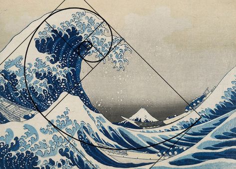
• It is a composition guideline to create more dynamism to a work of design/photography/film/painting.
• An image is divided evenly into thirds, both horizontally and vertically, and the subject of the image is placed at the intersection of those dividing lines, or along one of the lines itself.

Repetition:
• Repetition could make a work of design seem active.
• The repetition of elements of design creates rhythm and pattern within the work.
• Variety* is essential to keep rhythms exciting and active, and to avoid monotony.
• Pattern increases visual excitement by enriching surface interest.

Movement:
• The way a design leads the eye in, around, and through a composition - the path the eye follows.
• Motion or movement in a visual image occurs when objects seem to be moving in a visual image.
• Movement in a visual image comes from the kinds of shapes, forms, lines, and curves that are used.

Hierarchy
• Hierarchy is the choreography of content in a composition to communicate information and convey meaning.
• Visual hierarchy directs viewers to the most important information first, and identifies navigation through secondary content.

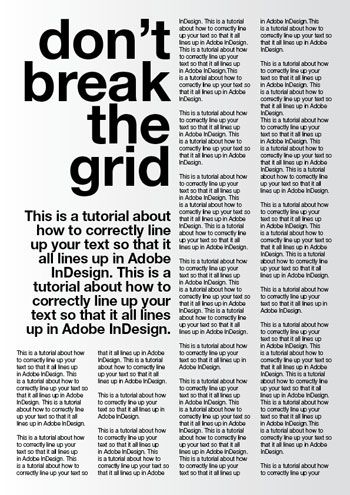
Alignment
• Alignment is the placement of elements in a way that edges line up along common rows or columns, or their bodies along a common centre.
• Alignment creates a sense of unity and cohesion, which contributes to the design's overall aesthetic and perceived stability.
• Alignment can also be a powerful means of leading a person through a design.
Harmony&Unity:
• Harmony involves the selection of elements that share a common trait.
• Harmony becomes monotony without variety*.
• Harmony is the sense that all of the elements of your design fit together. They may fit the same theme, aesthetic style or mood.
Unity refers to the repetition of particular elements throughout your design — whether they’re colors, shapes or materials — to pull the look together.
• Unity occurs when these elements are composed in such a way that they are balanced and give a sense of oneness, creating a theme.
• Although unity and harmony may sound similar, they each play distinct roles in the way we experience design.

Scale and Proportion
• Scale and proportion are both design elements that have to do with size.
• Scale is the size of one object in relation to the other objects in a design or artwork.
• Proportion refers to the size of the parts of an object in relationship to other parts of the same object.
• Throughout the centuries, designers have used scale and proportion to depict or distract from the ideal.
Scale
• Scale refers to the size and dimension of figures and forms relative to a specific unit of measure.
• Scale can be determined in two ways:
Proportion
• Proportion in art and design is the relationship of two or more elements in a composition and how they compare to one another with respect to size, color, quantity, degree, setting, etc.; i.e. ratio.
• Proportion is said to be harmonious when a correct relationship exists between the elements with respect to size or quantity.
• The effective use of proportion in design often results in harmony and unity.
Symbol:
• A sign, shape, or object that is used to represent something else
• In design, symbols can provide or convey information, equivalent to one or more sentences of text, or even a whole story

Pictorial Symbols
• Image-related and simplified pictures.
Abstract Symbols
• Abstract symbols can look like the objects that they represent but have less details.
Arbitrary Symbols
• Arbitrary symbols have no resemblance at all to the objects or the ideas they represent.
• The symbol is invented with the meaning constructed. Many are based on geometric shapes and colours.
• We have to learn arbitrary symbols.
Word And Image:
• Imagery is a vital part of design, be it print or digital. Users and viewers are able to relate to a concept or a brand if the right images are used in a work of design. It is therefore important to use suitable and relevant images when designing.
• Choosing the right words to pair with the imagery is of high importance as it would deepen the meaning of the design. Suitable typeface and strategic positioning of the type will result in visual hierarchy and balance in a work of design.
• Typography is the design and arrangement of text to convey a message or concept.
THE GOAL FROM UNSDG
My Choice of Design Work

Reason Why I Chose This Artwork
Indonesian designer Naufan Noordyanto skillfully uses positive and negative shapes to express the theme of "Trees VS industrial carbon emissions". The poster can be interpreted in two ways from different angles: from the top down, the smoky factory chimneys gradually turn into trees, thus calling on people to resist heavily polluting factories and plant trees to mitigate the impact of carbon emissions on the climate; from the bottom up, the dense forest gradually fades away and turns into factories and chimneys, which also implies the fact that the global forest cover is decreasing, and the industrial emissions are getting more and more serious. It shows the author's concern about climate issues.
Design Principles
Symmetrical Balance,Repetition,Harmony and Unity,Contrast
FEEDBACK
SELF-REFLECTION
First of all, studying the principles of design has made me realize that design is not just about beautiful appearance, but about the synthesis of function, structure and meaning. For example, the principles of balance, contrast, repetition and rhythm not only enhance the beauty of a design, but also improve its readability and effectiveness. By applying these principles, I am able to better organize information and convey the message I want to convey, making my work more attractive and impactful.
Secondly, learning the principles of design has made me deeply understand that design is a combination of art and science. In the process of creation, I not only need to use my creativity and imagination, but also need to use scientific principles to guide and optimize the design. For example, the principles of color theory, typographic rules and visual hierarchy have provided me with valuable guidance, enabling me to choose colors, layouts and compositions more accurately, thus creating works of greater quality and effect.


评论
发表评论