Start Week10-Week14
LI JINGBU/0367209
ADVANCED TYPOGRAPHY/Bachelor of design(honours) in creative media
Lectures
All lectures 1 to 5 completed in Task 1
Instruction
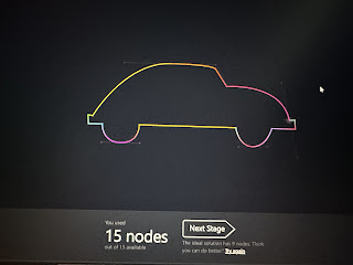
Task 3: Type Exploration & Application
Proposal Ideations:
Digitalisation:
Uppercase
I primarily utilized squares and half circles to create the font.
Lowercase
I generally referenced the way capital letters are designed and lowered the height appropriately for the design.
Number and Punctuation
In the design of the numbers I tried to differentiate them from the letters, for example, 4 and y are easy to confuse.
y
4
Then I worked on the punctuation.
Then I worked in FontForge and adjusted the word spacing.
Font application
For the theme colors, I chose red white and black with a series of designs that used a font I designed and some design symbols that mainly highlight my typography.Final Result:
Font
Font Link: Font(Sir, it seems like this should require a download before you can see it, probably because of FontForge)
Font Presentation:
Font Application:
Feedback
Week 11
General Feedback: The font needs to be resized consistently.
Specific Feedback: I started a capital letter design.
Week 13
General Feedback: Presentation needs some symbols and not all fonts.
Specific Feedback: I started with lowercase fonts and numbers.
Week 14
General Feedback: Task 3 and Final Reflection need to be completed.
Specific Feedback: Teacher instructed me on the way to enter lowercase letters into FontForge, and I learned a lot.
Reflection
Typography is not just about aesthetics, it's about making sure the text is readable. Designers need to weigh the visual appeal of the font against the comfort of the user in reading it.
Type designers need to understand the historical development of fonts and incorporate innovative elements into their designs. New typeface designs should be able to speak to traditional styles or provide a new visual language.
Fonts may appear differently on different media, such as on screen and in print. Designers need to consider how the typeface will perform at different resolutions and sizes, as well as its contrast and clarity against different backgrounds.
Further Reading
The use of Spaces is very important in typography. A serious typographer constantly monitors and manipulates the relationship of form (where type is) to counter-form (where it isn't). To understand this relationship, it is essential to see type as a progres sion of spaces (right). Changing any one space immediately alters its relationship with all the other spaces.
typography employs a number of technical terms. These mostly describe specific parts of letterforms.Knowing a letterform's component parts makes it much easier to identity specific typefaces
Uppercase
Capital letters, including certain accented vowels, the c cedilla (c) and n tilde (h), and the a/e and o/e ligatures (a, œe).
Lowercase
Lowercase letters include the same characters as uppercase plus f/i, f/1, f/f, f/f/i, and f/f/I ligatures, and the
'esset' (German double s).
Small capitals
Uppercase letterforms, drawn to the ×-height of the typeface. Small caps are primarily found in serif fonts.
Most type software includes a style command that generates a small cap based upon uppercase forms. Do not confuse real small caps with those generated artificially.
Uppercase numerals
Also called lining figures, these numerals are the same height as uppercase letters and are all set to the same kerning width. They are most successfully used with tabular material or in any situation that calls for uppercase letters.
Lowercase numerals
Also called oldstyle figures or text figures, these numerals are set to x-height with ascenders and descenders. They are best used wherever you would use upper- and lowercase letterforms. Lowercase numerals are far less common in sans serif than in serif typefaces.


评论
发表评论