DESIGN PRINCIPLE TASK 2(VISUAL ANALYSIS)
February 20, 2024
Starting date week3- Ending date week5
LI JINGBU/0367209
DESIGN PRINCIPLES/Bachelor of design(honours) in creative media
Task1 Link: https://0367209.blogspot.com/2024/02/design-principle-task1-exploration.html
INSTRUCTION
VISUAL ANALYSIS
The design work I have chosen
OBSERVATION:
From the top down, the smoky factory chimneys gradually turn into trees, from the bottom up, the dense forest gradually fades away and turns into factories and chimneys. There is more white than black on top and more black than white on the bottom.The whole work consists of only black and white, with two lines of text at the top and bottom that are the author's expression of the theme of the work.(75)
The entire piece is basically symmetrical from left to right, giving it a sense of symmetrical balance, and the principle of repetition is reflected in the repetitive arrangement of trees and chimneys. Harmony as a design principle through graphics with common features,The same black and white to show unity. The black color contrasts strongly with the white, and the overall whiteness above and blackness below also reflect the contrast.Due to the designer's exquisite handling of positive and negative shapes, the whole layout shows a sense of gradation, with white space gradually decreasing and black space gradually expanding from top to bottom, which is full of rhythm and order.(111)
INTERPRETATION
This is a design by Naufan Noordyanto, one of the top ten entries in the 5th Segunda Llamada International Poster Design Competition. He used the style of positive and negative shapes to express his concern about climate change. He also used the same style in two of his other works.These two works also equally show his concern for the human living environment, one is global warming while the other is the deterioration of the living environment. These show that the author cares about the environment. In this work, the black smoke factory chimneys gradually turn into trees, which can be seen as a call for people to resist the heavy pollution of factories, while the dense woods gradually fade into factories and chimneys, implying the author's concern about climate change.(130)
reference:https://www.behance.net/naufannoord
FEEDBACK
SELF-REFLECTION:
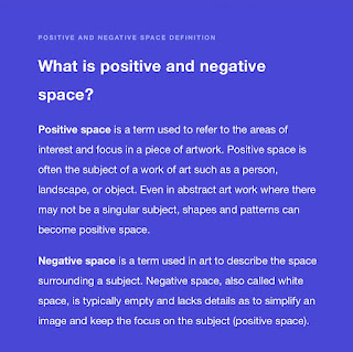
I learned about the application of positive and negative shapes. Positive shape refers to the physical presence of an object, while negative shape is the shape or background of the surrounding space. In design, the relationship between positive and negative shapes can be balanced and contrasted by changing the size, shape, and color of an object. The contrast between positive and negative shapes can enhance the attractiveness and visual effect of the design, as well as help us better understand the principles of space utilization and composition.
FURTHER READING:


评论
发表评论